Descriptive Statistics
Long before any statistical methods were formalized, graphical and numerical data summaries were used to draw informal statistical conclusions. There are many examples of earlier graphics that surely influenced graphics used today.
William Playfair (1759-1823) developed some early versions of many common modern statistical graphics, including pie charts, bar charts, and line graphs. Contrary to those of his time, he believed that a graphic was a better way to convey data than a table. He was the first to use hatching, shading, and color in his graphics to increase readability. He also applied these graphics to different areas of study, including using line graphs to describe economic data.

Edward Tufte (2001) discussed the development of data maps. Data maps were first created in the seventeenth century, 5000 years after the first geographic maps were drawn in clay. Edmond Halley (1656-1742), famous for predicting the reappearance of his eponymous comet, represented the data he collected about ocean winds in a map.
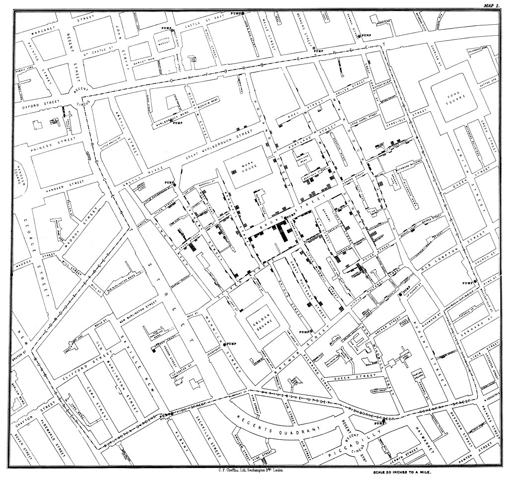
John Snow (1813-1858) used data maps when considering cholera pandemics that had spread from India across Europe and Asia. At his time, there was no cure for cholera, so prevention was the only solution. He started to look at patterns of outbreaks from the second pandemic. From this, he suspected that the spread was connected to drinking water, but because there were many other suspicions, he needed more evidence to convince others. He looked specifically at the outbreak in the Broadstreet area of London at the end of August 1853. He interviewed families of those who were sick, organized the data on a map, and noticed that most would have collected their water from the pump on Broadstreet. There were a few cases without a direct connection at first; for example, an elderly woman that had lived in the Broadstreet area and had moved still preferred the taste of that water, so she sent for a bottle of water from the Broadstreet pump daily. They found that the first victim was a five-month-old girl, and her family's cesspool was only three feet from the pump. Snow's work did not look at what directly causes cholera, such as a bacteria or virus, but he did find a correlation between people who got sick and their water source. In this way, he was able to provide practical knowledge even without biological information.

Florence Nightingale (1820-1910) was a self-proclaimed statistician who is more well known in the nursing profession. She helped soldiers in the Crimean War and used data from the war to show the importance of maintaining field hospitals and sending medical supplies to soldiers in the field, citing the large proportion of deaths due to illness or untreated wounds compared to those from combat. Crucial to her persuasion were statistical graphics, including a variation on pie charts.

John Tukey (1915-2000) created both the box and whisker plot and the stem and leaf plot, arguing that they would be less likely to deceive than other contemporary graphics. Graphics used to summarize continuous variables became more common in the 1830s, including some which are like histograms. Karl Pearson (1857-1936) coined the term “histogram” in his 1895 public lectures. Variations on traditional graphics continue to appear, and their effectiveness depends on their ability to communicate information clearly and quickly.