Microsoft Word Accessibility
Microsoft Word is a great tool for creating and editing documents. The following tips and resources can help you create documents that are accessible to all users.
Headings
A good heading structure helps users understand the layout and content of a document. It’s essential to screen reader users, because it allows them to navigate the document using the headings.
Heading formatting should initially be done using the Word “Heading Styles” feature. You can then adjust the font size and color to fit your preferences. To add a heading style, go to the “Home” tab, then to “Styles,” and select the appropriate heading level from the drop-down menu.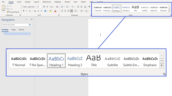
Heading Levels
Microsoft Word allows for nine heading levels (Heading 1 - Heading 9). Heading levels should not be skipped, meaning you should go from Heading 1 to Heading 2 to Heading 3, rather than from Heading 1 to Heading 3.In other words, heading levels should be used as follows:
- Heading 1: The document title or the main content heading. There should only be one Heading 1 per document.
- Heading 2: A major section heading.
- Heading 3: A subsection of Heading 2.
- Heading 4: A subsection of Heading 3, and so on.
Alt Text for Images
Alternative text (alt text) is a short description of an image. It is essential for screen reader users and will be displayed if the image is not loading for any reason. If you’re new to writing alt text, you can learn the basics from our alt text page. All of the images in a document should have alt text. To add alt text, right-click the image and choose “Edit Alt Text.” You can then use the form that opens on the right side of the screen to enter the alt text. For more detailed steps, follow these instructions from Microsoft.
Tables
Because tables organize information visually, screen reader users will have trouble following the information they contain unless they are formatted correctly. For example, tables should always have column and row headers. For more instructions, visit our table accessibility page. Microsoft also has a page on creating accessible tables in Word.
Links
The text for links should briefly describe the link destination. Avoid using language like “Click here”, “Link to…”, or text that is vague or out of context. All the links in the document should be functional and lead to the correct website. For more detailed instructions, visit our link accessibility page.
Lists
If your document includes lists, you should use the built-in list functions to add them. Don’t create lists by indenting text, using hyphens as bullet points, or typing out each number. The list buttons in Word can be found under the “Home” tab in the “Paragraph” section.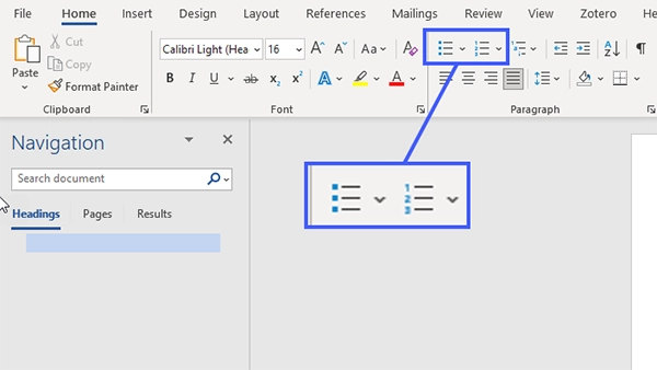
Font Size and Color
Generally, font size should be at least 11pt. Use an easily readable font, such as Verdana, Tahoma, Arial, Georgia, or Palatino. The text should have high contrast with the background color. For example, dark-colored text should be on a light background, and vice versa.
Accessibility Checker
Microsoft Word has a built-in Accessibility Checker that you can use to review your document for accessibility issues. To open the checker, click on the “Review” tab and select “Check Accessibility”.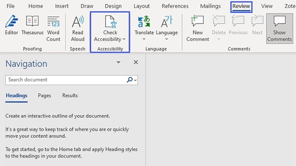
A sidebar will open with the results of the accessibility check. You can easily fix the issues by clicking on them and choosing one of the recommended fixes.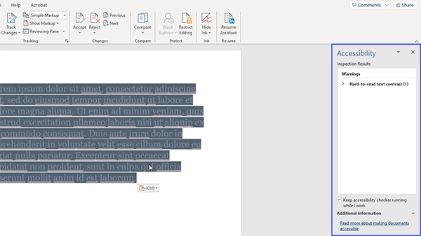
Additional Resources
- For a more extensive explanation of Word document accessibility, see Microsoft Support’s instructions for making your Word documents accessible.
- To use Word to generate accessible PDF files, follow WebAIM’s instructions for converting Word documents into accessible PDFs.
- Western Washington University also has a helpful page about creating accessible Word documents.
If you would like to learn more about document accessibility, consider participating in our online Document Accessibility course.