PowerPoint Accessibility
There are some basic steps you can take to ensure that your PowerPoint presentations are more usable for everyone and accessible for users with disabilities.
General Presentation Usability
- Keep it simple, and remember that when it comes to presentations, less can often be more by focusing on a few key points and using bullet points.
- Consider using a font size of at least 30 to make sure your text can be read by everyone.
- Consider starting with an accessible PowerPoint template - you can find many examples in the Microsoft Template Gallery or in PowerPoint by going to File > New and search for “accessible templates”.
Accessibility Checker
Microsoft PowerPoint provides a built-in accessibility checker that reviews your presentation for accessibility issues. To use this checker, click on the "Review" tab (in the top ribbon), and select ”Check Accessibility”.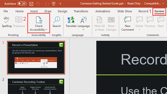
A sidebar will open with a list of accessibility errors. You can click on any of the errors for instructions on how to fix the problem.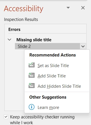
For more information, visit Microsoft’s instructions for using the Accessibility Checker.
This checker is a good place to start, but it’s important to remember that it is automatic and may not detect all of your presentation’s accessibility issues.
Alternative Text
All of the images in the presentation should have alternative text, or alt text. To add alt text, right-click the image and choose “Edit Alt Text.” You can then add alt text or mark the image as decorative, if appropriate.
Slide Layout
Microsoft PowerPoint offers a variety of slide layouts. These typically include a title and one or more content areas. When possible, it is best to use these pre-made slide layouts. This will ensure that slides have the correct heading structure and reading order.
Reading Order
If you don’t use a layout, it’s important to pay attention to the reading order. When screen readers are reading a slide, they do so in the order that the elements are added. For example, if you were to add a photo and text box before you added your Title, then your Title would be read last.
To check and/or change the reading order, navigate to Home, Arrange, and then Selection Pane.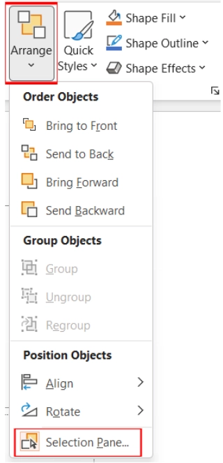
A Selection Pane sidebar will open with the items in their reading order. This reading order is listed from bottom to top, so the bottom item will be read first. You can reorder these items by clicking and dragging.
Color Contrast
There should be high color contrast between a slide’s text and its background. When possible, use dark-colored text (such as black) on a light, off-white background.
Additional Resources
- For a more extensive explanation of PowerPoint accessibility, see Microsoft Support’s instructions for making your presentations accessible.
- The Department of Rehabilitation has summarized this process in Seven Steps to Creating an Accessible PowerPoint. Part of this document provides information about how to make live presentations more accessible as well.
If you would like to learn more about document accessibility, consider participating in our online document accessibility course.