Color Contrast
Color contrast is the difference in brightness between foreground and background colors. Sufficient color contrast allows low-vision and colorblind users to access digital content.
Basics
The standards for color contrast are outlined in the Web Content Accessibility Guidelines, or WCAG. While WCAG is designed for use on websites, it also applies to other digital content such as Canvas pages and certain print documents. The guidelines cover a number of different topics, and have requirements to meet both minimum (Level AA) and enhanced (Level AAA) accessibility. The guidelines have been summarized below.
Resources
Color contrast can be checked automatically using a browser extension such as WAVE, or manually using sites like the WebAIM Contrast Checker. There is also a great app, TPGi, that will allow you to pick color from anywhere.
Text
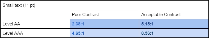
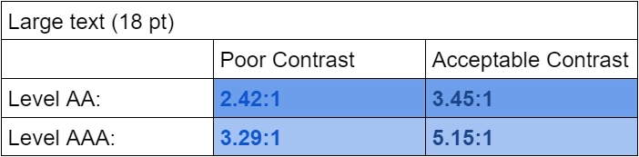
There are different standards for different text sizes:
- Small text (smaller than 18 pt, or bold and smaller than 14 pt)
- Level AA: ratio of at least 4.5:1
- Level AAA: ratio of at least 7:1
- Large text (18 pt or higher, or bold and 14 pt or higher)
- Level AA: ratio of at least 3:1
- Level AAA: ratio of at least 4.5:1
- Text links that are not underlined must have both a 4.5:1 contrast ratio with the background and a 3:1 contrast ratio with the surrounding text
- If both these conditions cannot be met, the link must be underlined.
Examples:
Graphic Elements
- Include charts, images essential to site comprehension, and images used as links
- Graphics must contrast with both the background and other elements of the image
- Graphic elements must have contrast of at least 3:1
Examples:
Poor Contrast (Element Parts)| Poor Contrast (Background) | Poor Contrast (Element Parts) | Acceptable Contrast | |
|---|---|---|---|
| Button |  |
 |
 |
| Chart |  |
 |
 or  |
Page Element States
Some web page elements change appearance when a user interacts with them. These elements must have sufficient contrast in all their states.
- Text links must have a minimum contrast ratio of 4.5:1
- Graphic links must have a minimum contrast ratio of 3:1
- Boxes or underlined text that appear with user interaction must have a minimum contrast ratio of 3:1
Use of Color
Color should never be the only thing used to convey information. However, color can be useful for sighted users. When using color, also include another indicator such as a symbol or description in order to be fully accessible.
Examples:
Poor Use of Color:
| Assignments: |
|---|
| Essay 1 |
| Essay 2 |
| Essay 3 |
Acceptable Use of Color:
| Assignments: | |
|---|---|
| Essay 1 | Complete |
| Essay 2 | Incomplete |
| Essay 3 | Complete |
Exceptions
There are some exceptions to the rules outlined above.
- Text that does not need to meet the 4.5:1 contrast ratio requirement:
- Text in an image that is not meant to be read
- Text included in a logo
- Text that is not visible to anyone
- Interactive text that is inactive (often indicated through reduced opacity)
- Graphic elements that do not need to meet the 3:1 contrast ratio requirement:
- Elements defined by the browser
- Logos that are not being used as links
- Logos that are being used as links, but which are accompanied by text with sufficient contrast
- Inactive elements